Case
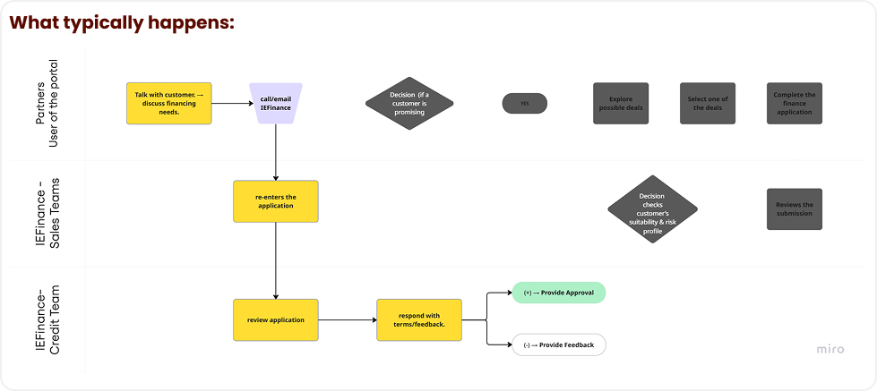
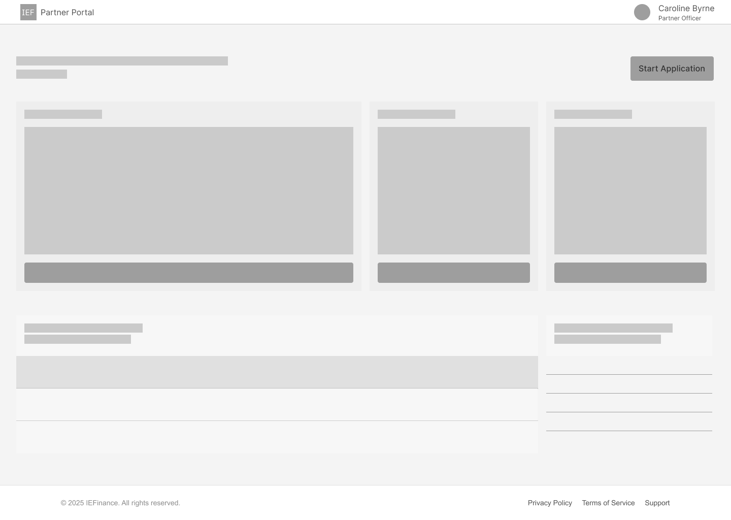
- The portal has not been widely adopted. Partners often reach out directly to IEFinance’s sales support via calls and emails, leaving IEFinance staff to complete the application on their behalf.

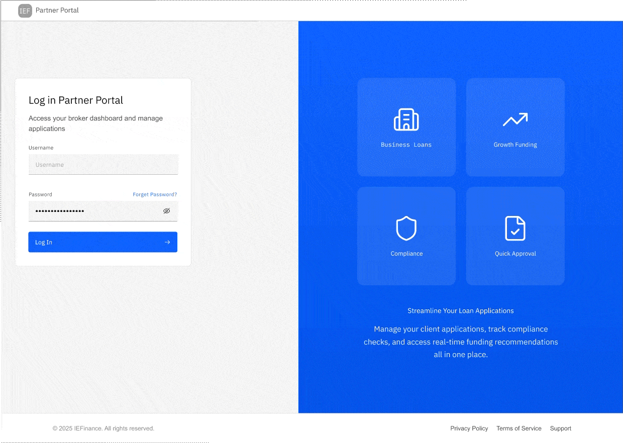
A broker portal redesign for IEFinance to streamline the loan application workflow, improve data accuracy, and provide early compliance insights using CRO and Revenue data. My role included end-to-end UX/UI design over four months.
UX/UI Designer — Led end-to-end redesign of the broker loan application, from research and IA to high-fidelity UI and prototyping using IBM Carbon.
Figma · IBM Carbon · Miro · FigJam · Notion
4 months (Research → Design → Prototype → Testing)
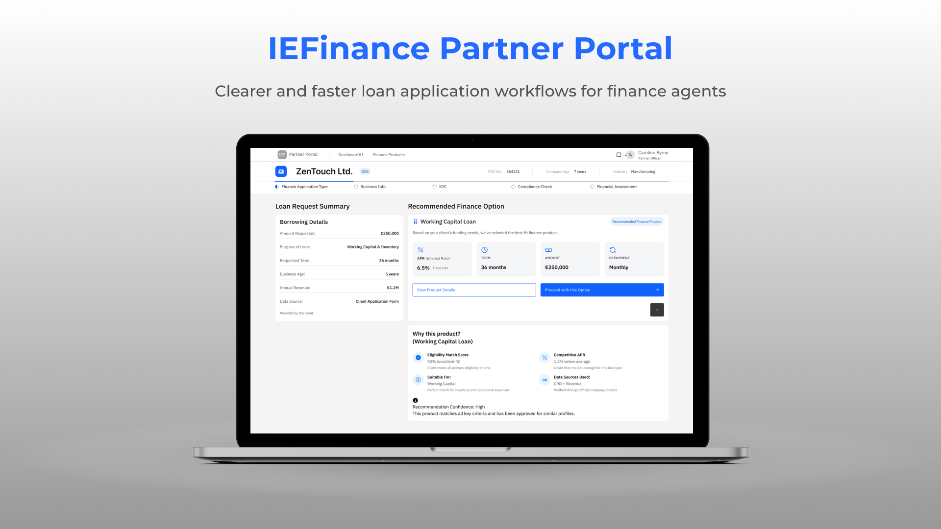
The IEFinance Partner Portal redesign focuses on improving the end-to-end loan application experience for brokers and financial partners. The existing system relied heavily on manual data entry, fragmented information sources, and inconsistent workflows, creating unnecessary friction during the application process.
I began by analysing the existing partner portal to understand its workflow, pain points, and data gaps. This revealed unclear progress, fragmented information, and early data demands on brokers. These insights led me to create a Service Blueprint mapping broker actions, IEFinance processes, and external data sources, helping identify where UX improvements, automation, and early compliance indicators would add the most value.

I began by analysing the existing partner portal to understand its workflow, pain points, and data gaps. This revealed unclear progress, fragmented information, and early data demands on brokers. These insights led me to create a Service Blueprint mapping broker actions, IEFinance processes, and external data sources, helping identify where UX improvements, automation, and early compliance indicators would add the most value.

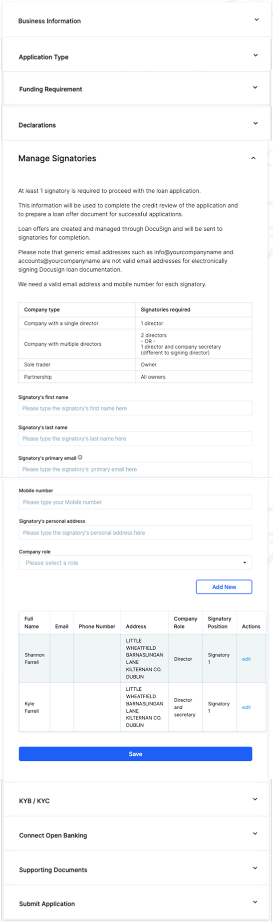
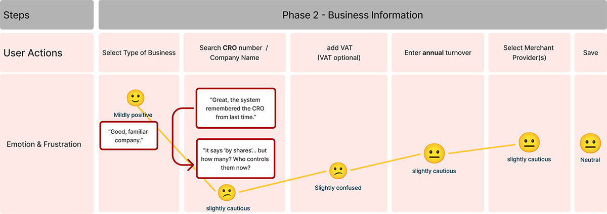
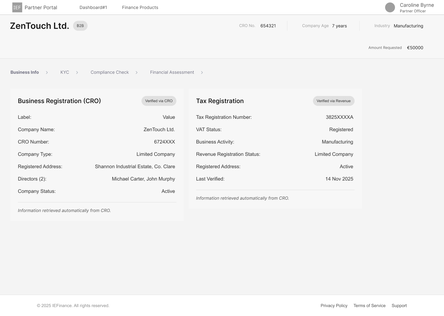
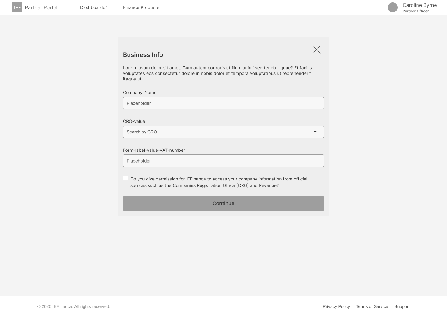
The business information is associated with a CRO number
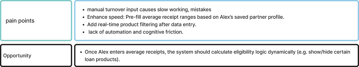
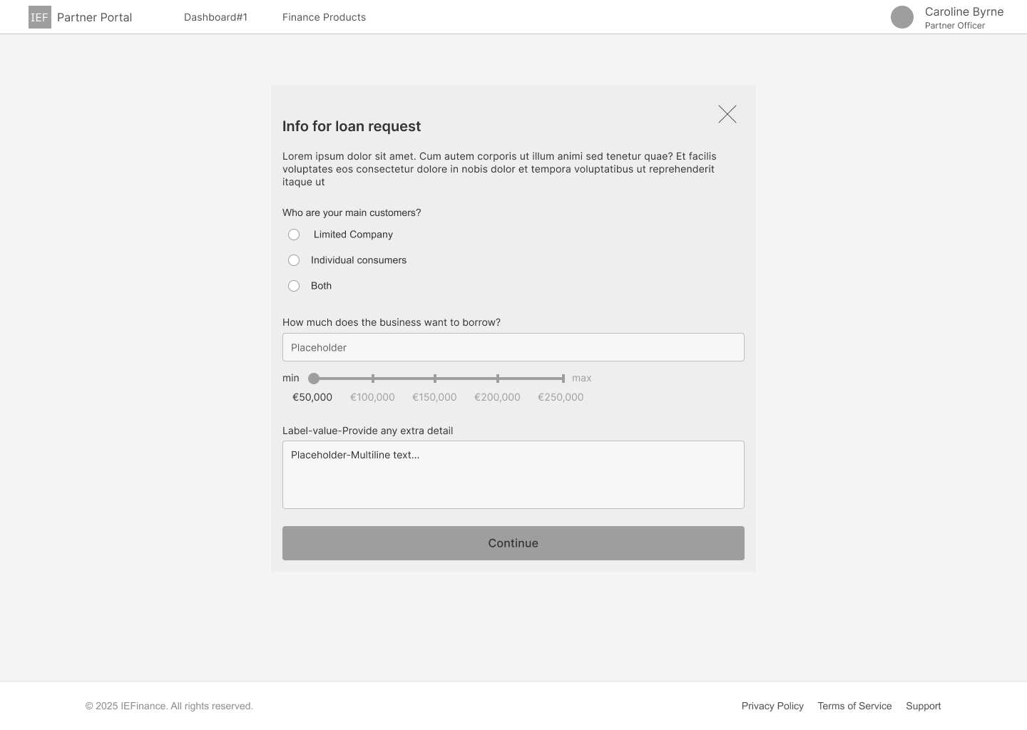
the monthly amount of card and non-card receipts. the type of deals
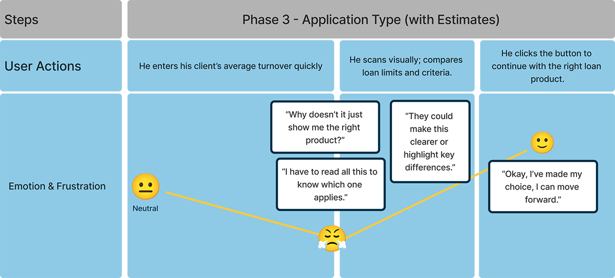
Phase 3 is the decision phase, determining whether the customer is promising.
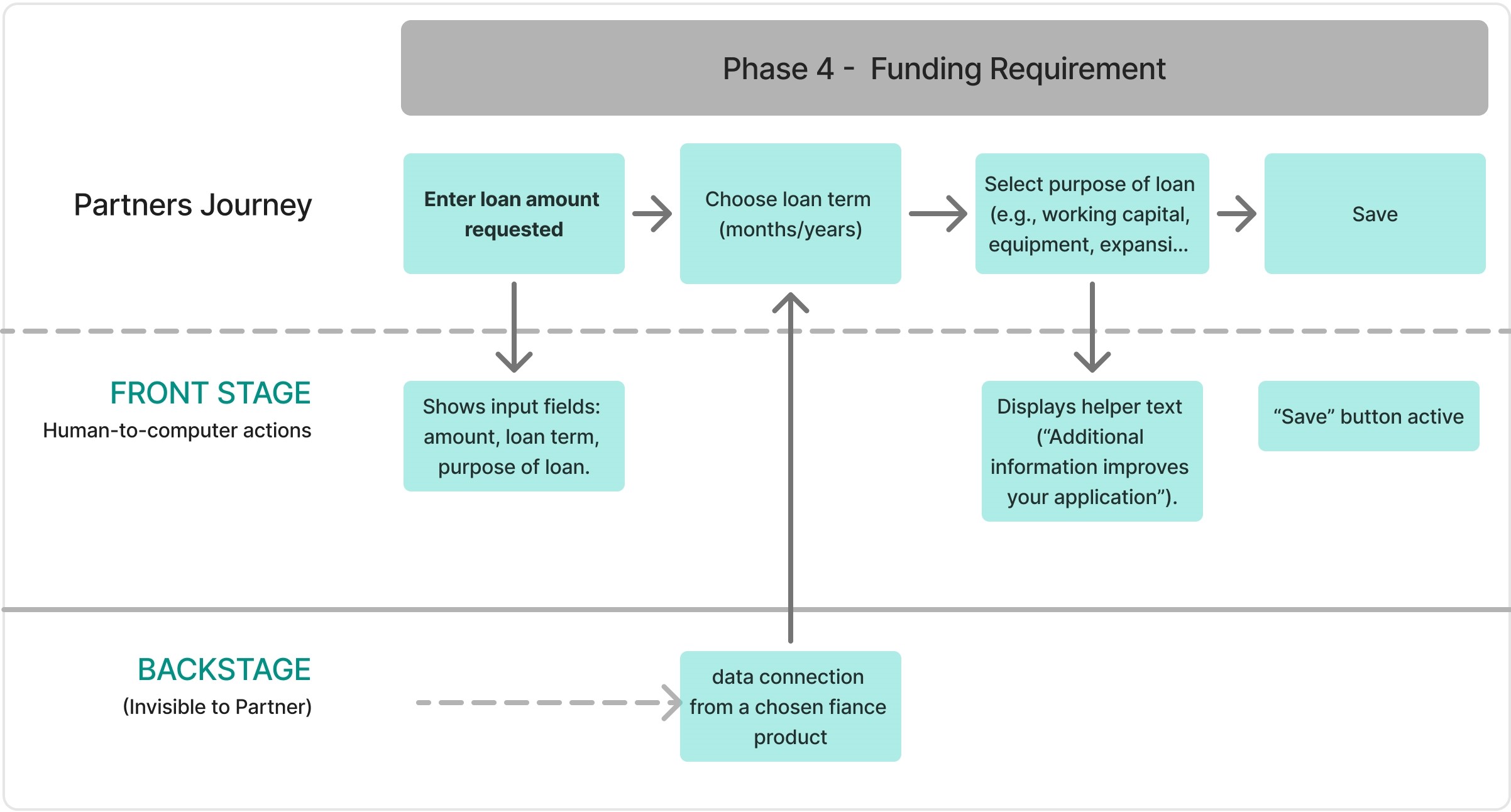
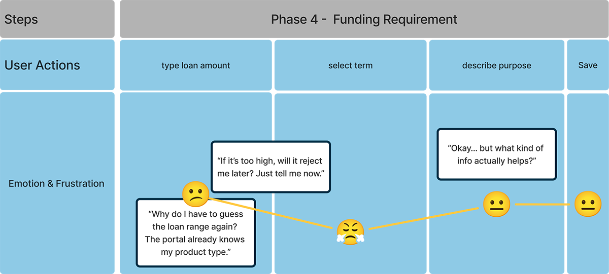
Loan Amount
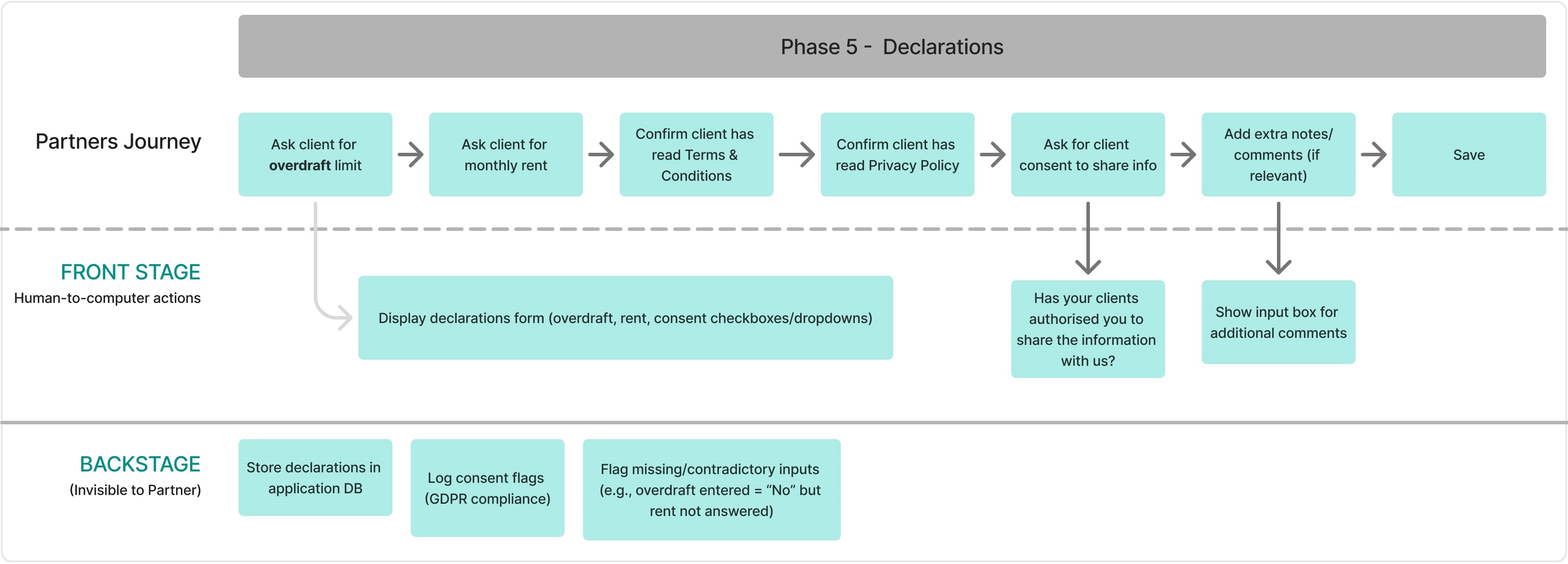
authorization for clients
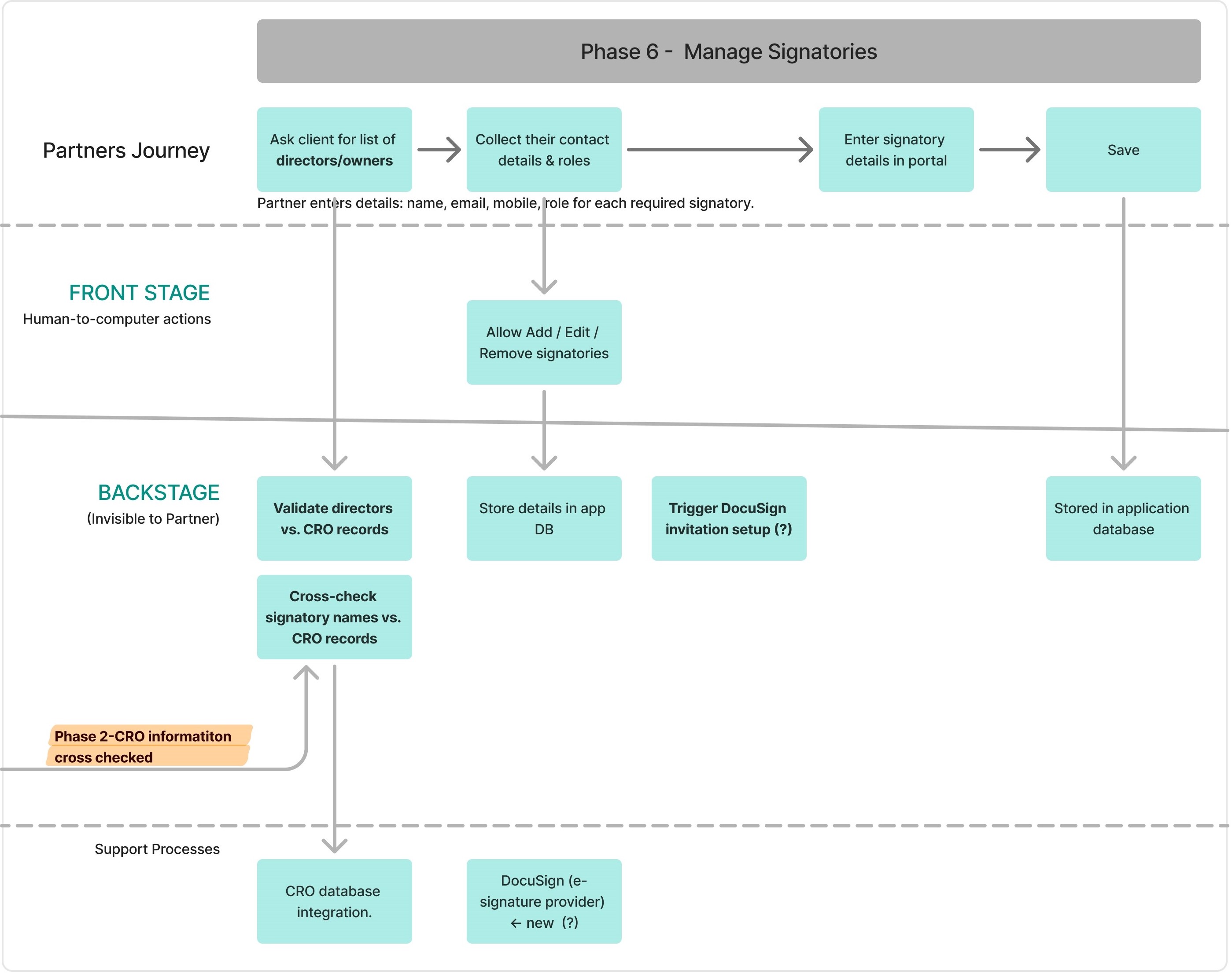
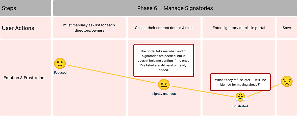
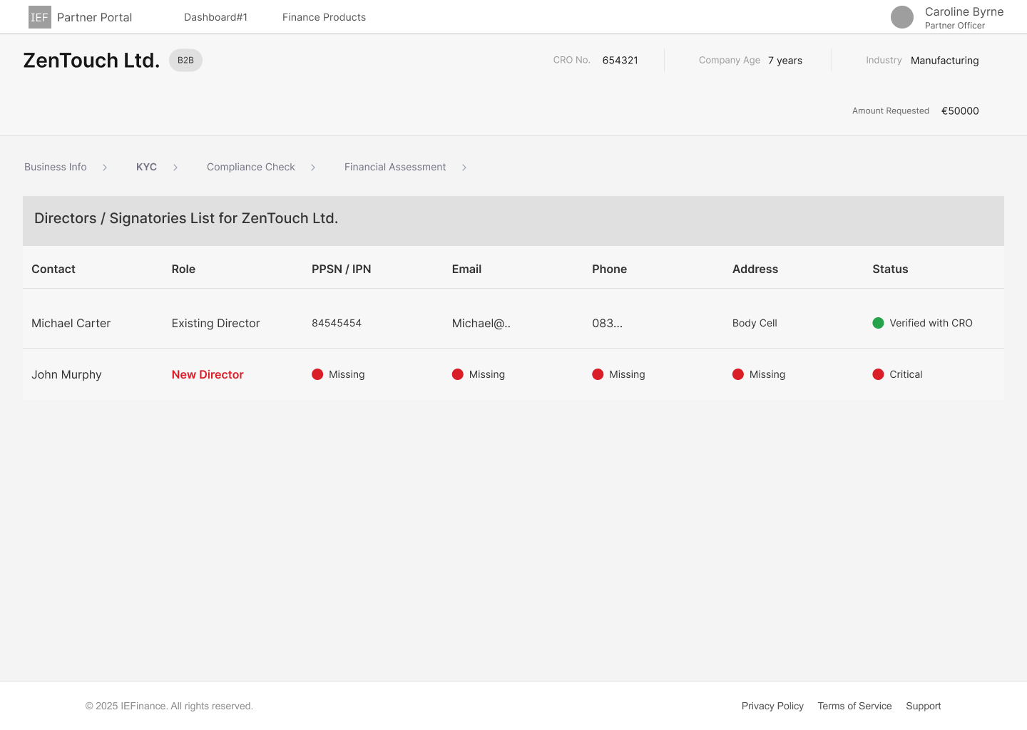
Identification of customers: Each requires a signatory. Cross check with
If there is a mismatch info, the loan may be delayed.
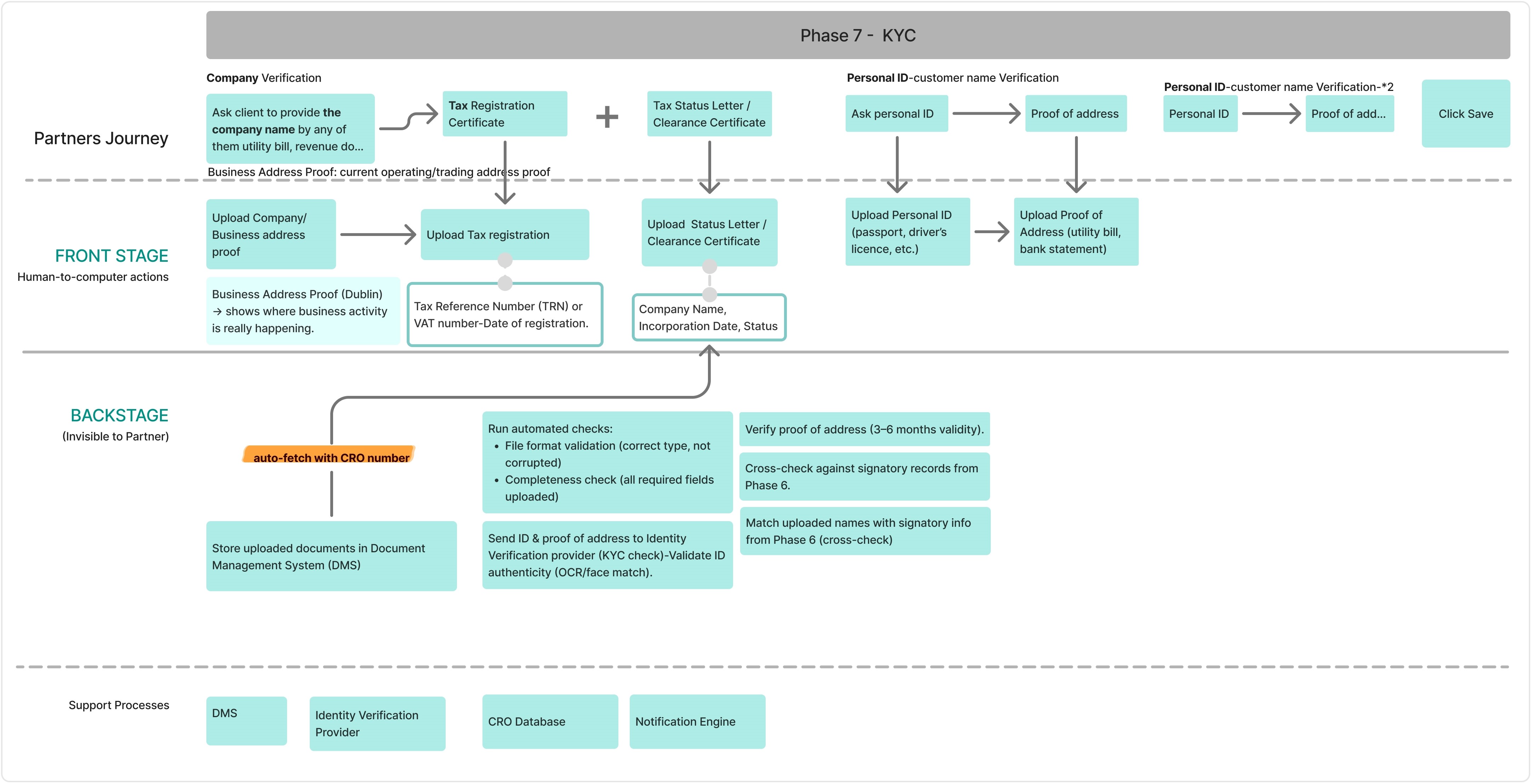
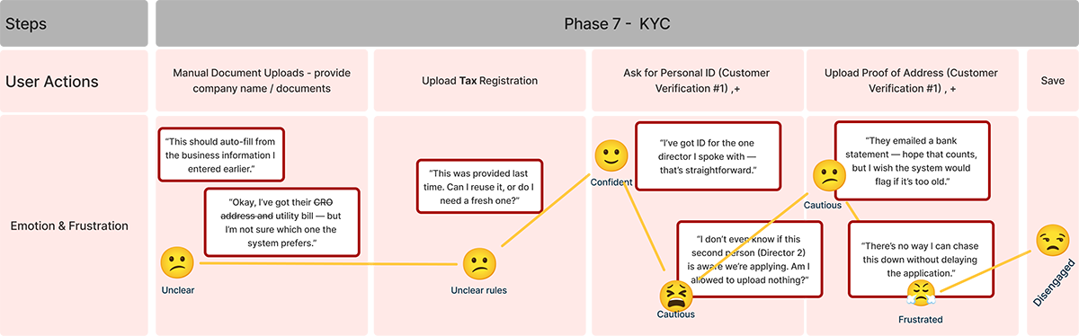
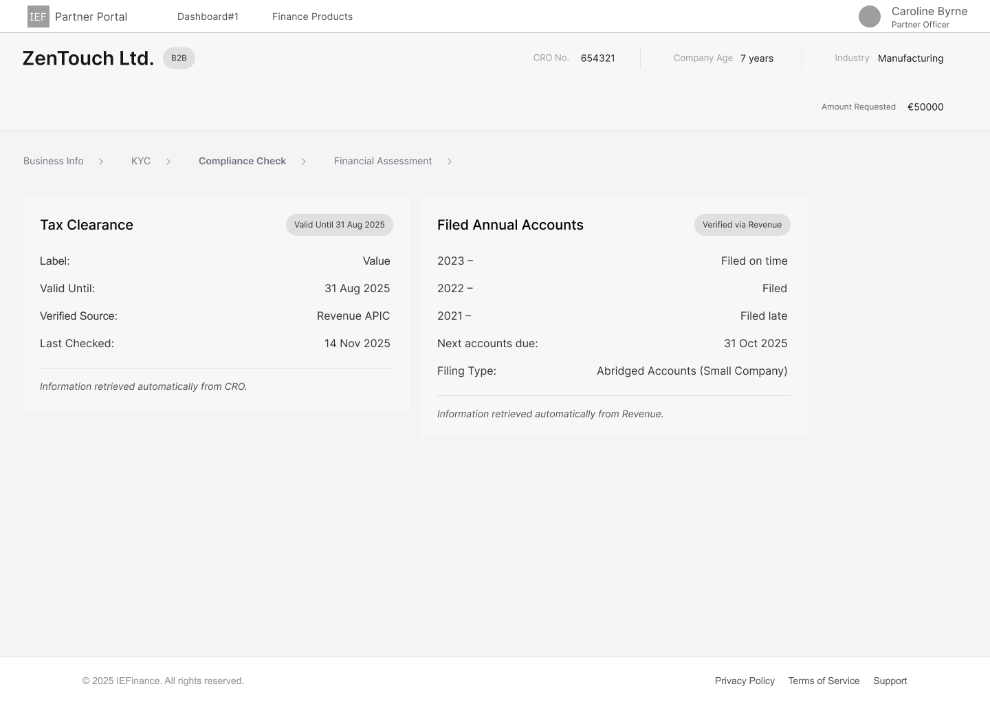
Know your customer:Business tax number (VAT) - verification Personal ID vefirication
KYC is where the most required documents are uploaded.
Clients take time to collect the whole documents, which cause frustration for partners.
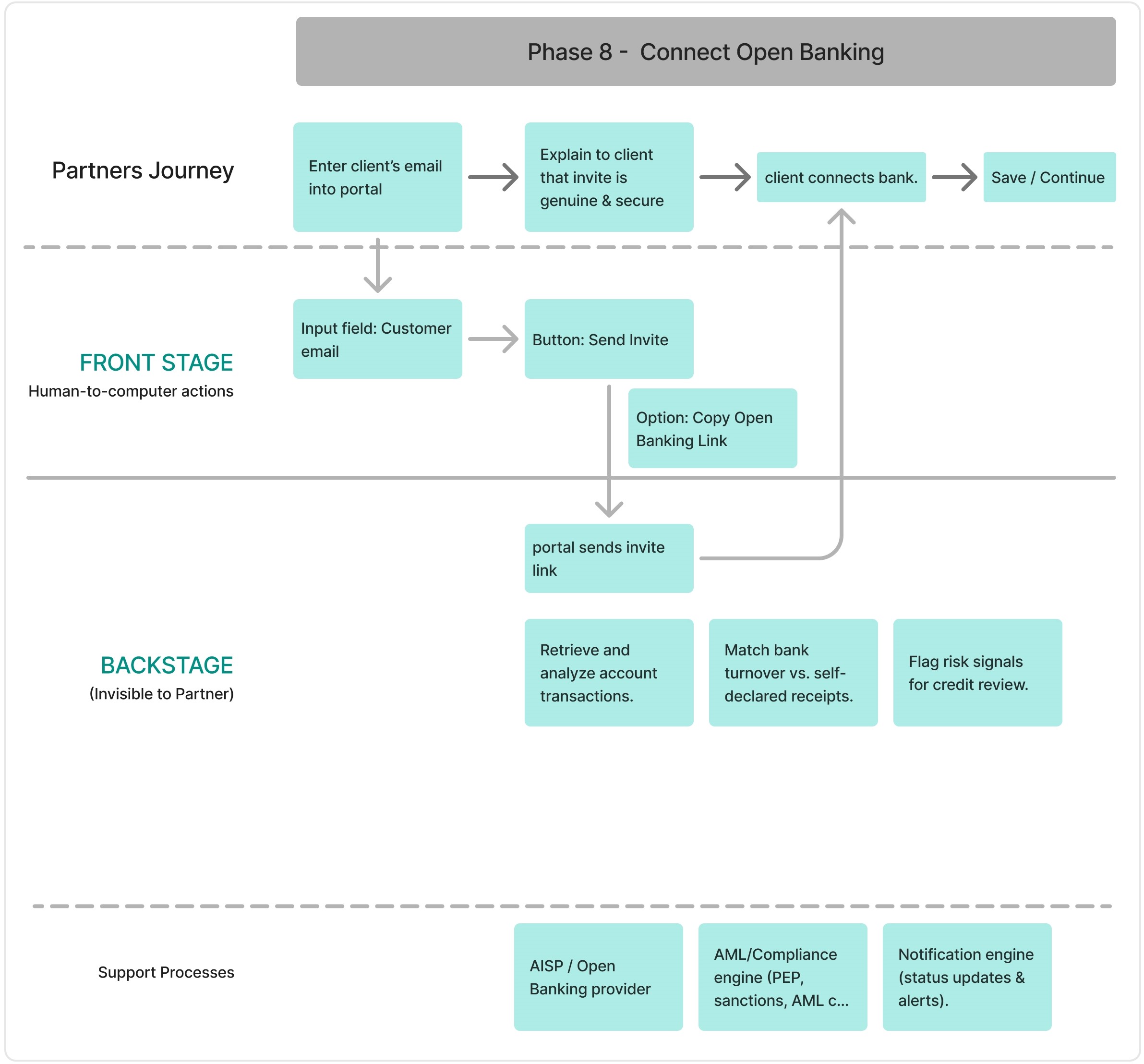
Connect Open Banking : System can fetch bank data automatically
What if clients do not want share it with open banking (?)
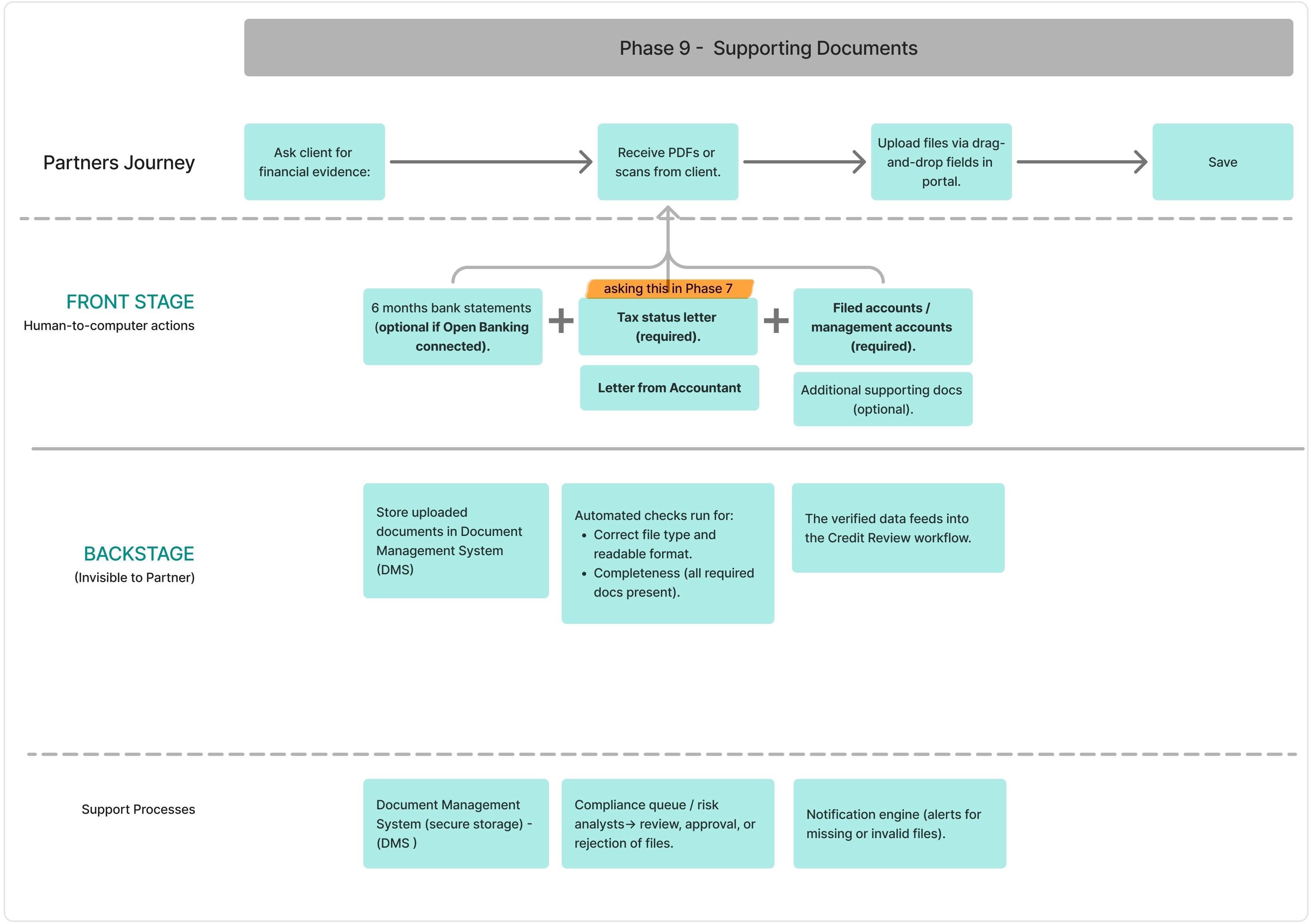
Supporting Doc: Tax Status level required.
To validate my early assumptions, I conducted a survey simulation based on industry research and broker discussions. While I did not have access to real users, this approach helped test whether the identified pain points aligned with common broker challenges in SME lending.
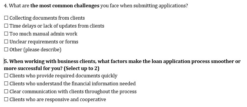
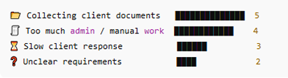
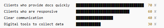
These early signals were validated through exploratory research, confirming friction around document collection, manual admin workload , and communication speed .
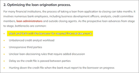
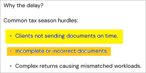
I conducted exploratory research across lender documentation, broker-focused articles, and industry reports to validate early signals around delays in loan applications. This research confirmed that document collection is the primary bottleneck, driven by incomplete submissions, unclear requirements, and repeated follow-ups.
This empathy map captures the behaviours, thoughts, and emotional states of brokers during the SME loan application process, based on exploratory research and validated survey signals.
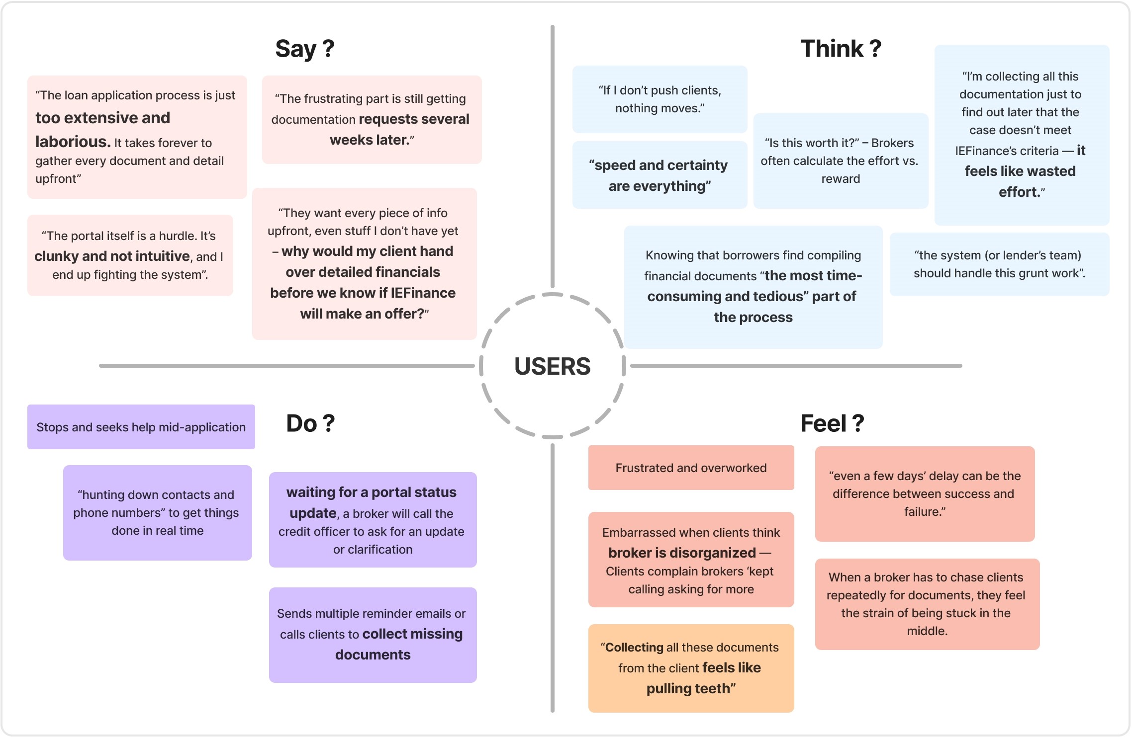
Financial partners (brokers) submitting SME loan applications through IEFinance’s Partner Portal.
A faster, clearer way to progress applications using the information and documents they already have — with transparency around what is required, when, and why — without waiting on clients or repeatedly interrupting the process.
Because the portal requests detailed customer information and documents too early, brokers are unable to progress applications independently. This leads to delays, frustration, and reliance on IEFinance’s Sales Support instead of the digital portal.
Early friction causes brokers to abandon the portal mid-application, increasing manual workload and slowing loan processing.
Personas were created through exploratory research, combining repository research and empathy mapping, and synthesised using a proto-persona approach.
Both personas share similar pain points within the IEFinance
process — complexity, document delays, and lack of
clarity.However, their motivations and expectations differ,
shaping how each reacts to these challenges.
Caroline seeks reassurance and trust, while Alex seeks efficiency
and control — and these differences guide distinct UX strategies
for improving the portal experience.
This section captures the core jobs each partner is trying to accomplish across the loan application journey.
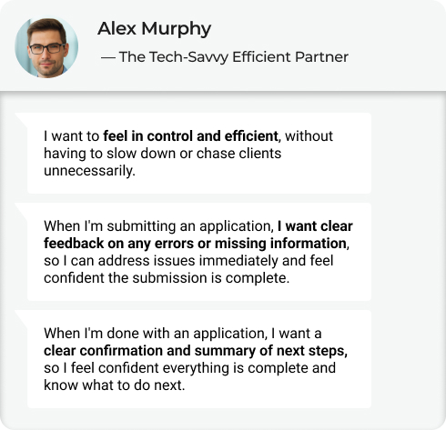
Complete and submit accurate loan applications with confidence and minimal friction, while clearly understanding what is complete, what is missing, and what happens next — without unnecessary rework or delays.
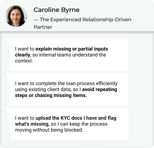
Alex wants the system to do the heavy lifting, so he can move quickly and confidently across multiple applications. Caroline wants the system to support her judgement and communication, so she can confidently guide clients and maintain trust. Both partners want to submit accurate applications with minimal friction — Alex prioritises speed and control, while Caroline prioritises clarity, trust, and continuity.
To translate personas into actionable design insights, I analysed how each persona experiences critical phases of the application journey.

The Tech-Savvy Efficient Partner
His goal: to complete the client’s loan application quickly and accurately, without needing back-and-forth communication or manual rework.

The Experienced Relationship-Driven Partner
Her goal: is to submit a complete and accurate loan application, even when client documents are delayed or flawed — while also ensuring she can clearly advise her clients on what’s missing or incorrect to prevent delays or rejection.


Building on the personas and their Jobs to Be Done, I translated key pain points into How Might We statements to explore solution directions. These questions helped me identify where the loan application experience could better support partners throughout the journey.
— The Tech-Savvy Efficient Partner
Users lack clarity at submission
HMW can we give partners real-time visibility into application progress so they stay in control?
Re-uploading valid documents slows down Alex’s workflow
How might we reuse previously submitted, valid documents?
Errors or completion status are discovered too late
How might we surface errors and confirm completion instantly?
Persistent real-time progress tracking.
Intelligent document reuse
Real-time validation & clear completion states
— The Experienced Relationship-Driven Partner
Missing docs block progress
How might we allow partners to submit partial KYC documents, showing what’s missing?
Repetition breaks continuity
How might we reuse verified client data so partners don’t repeat steps ?
Changes create uncertainty
How might we help partners stay confident and informed when company information changes?
Partial submission + missing indicators
Persistent client data reuse
Change indicators + contextual explanations
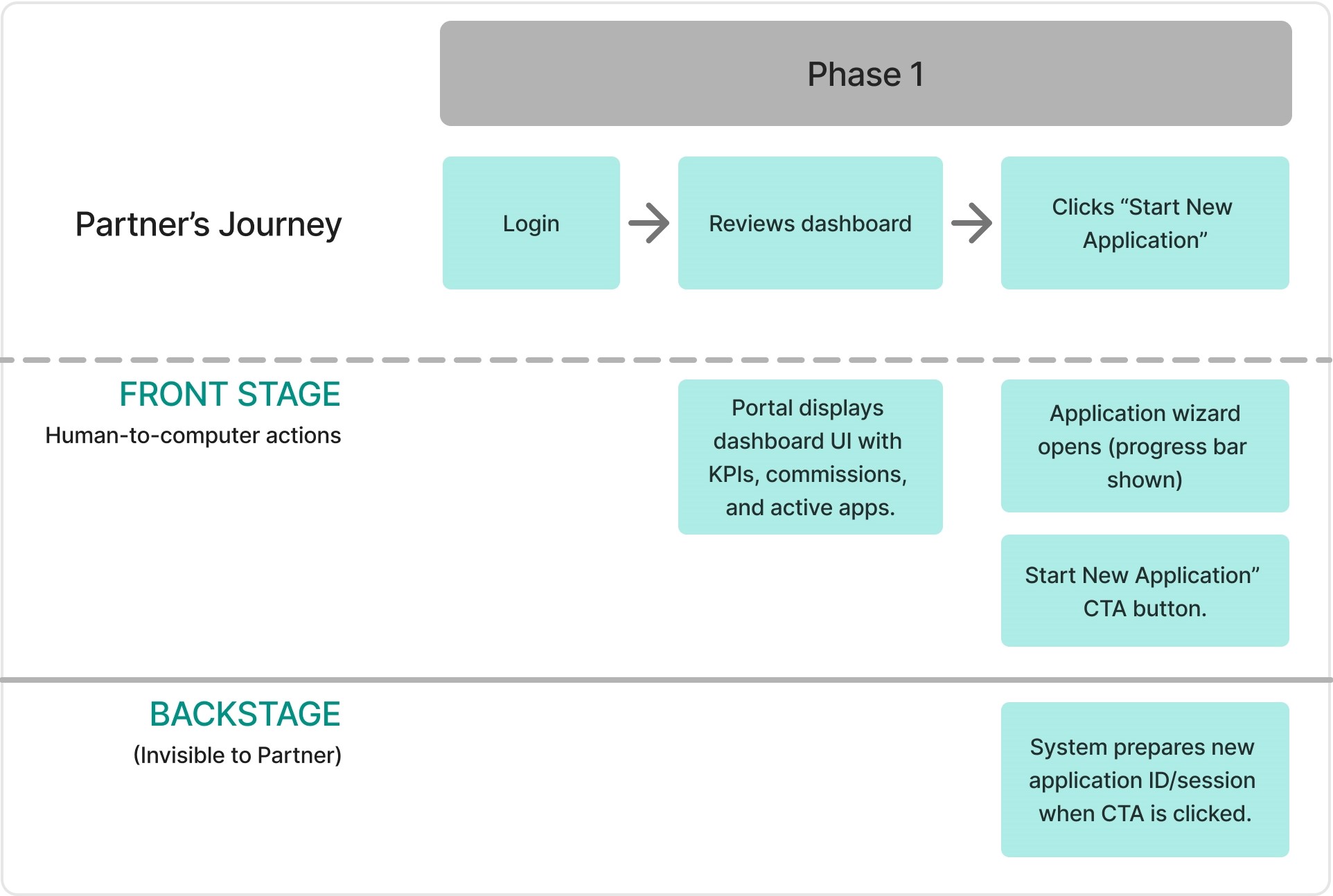
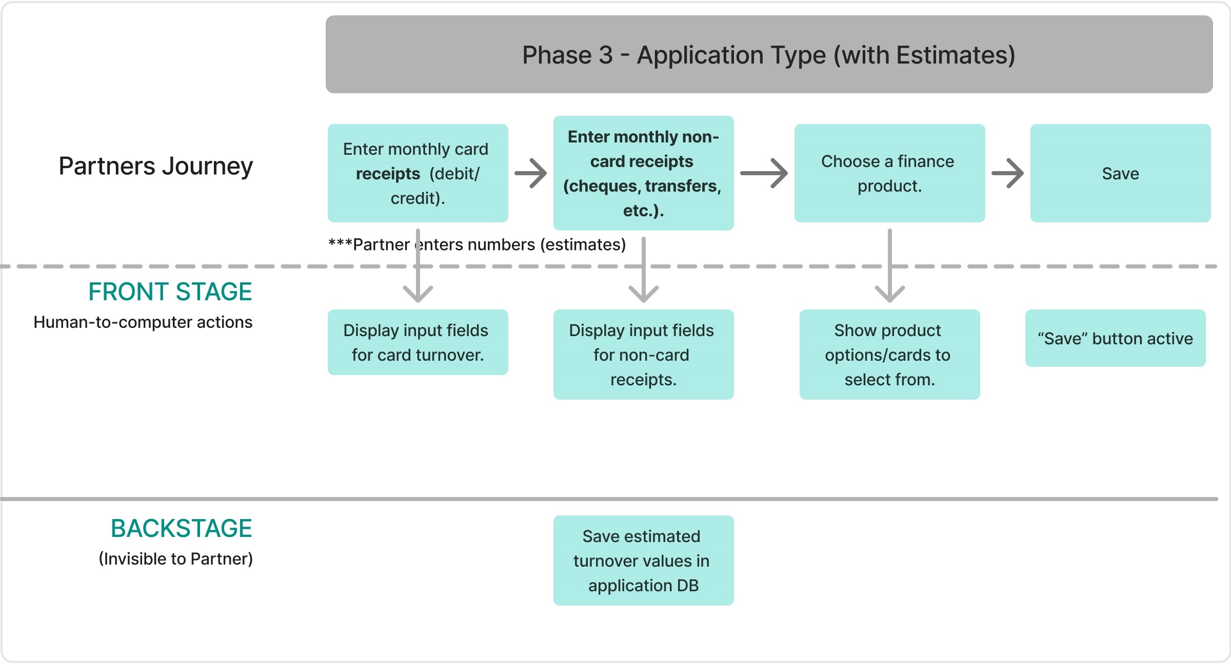
I mapped the full broker journey from entry to submission to validate task order, responsibility boundaries, and system feedback before refining UI or interactions.
The journey illustrates how brokers progress from initial access through data collection, product recommendation, and multi-stage review before submission. At this stage, the focus was on validating task order, responsibility shifts, and system clarity — deliberately removing visual styling to prioritise usability.
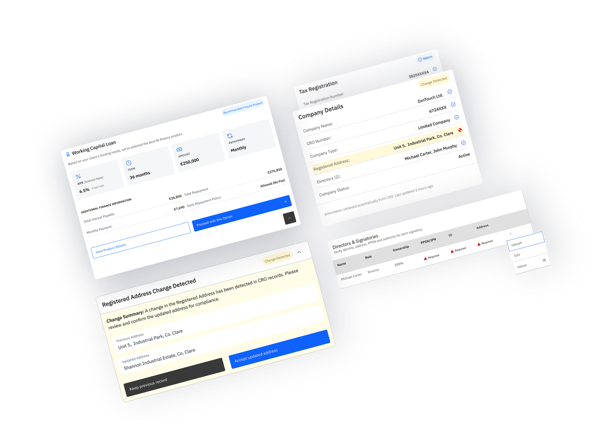
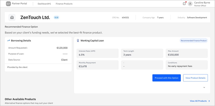
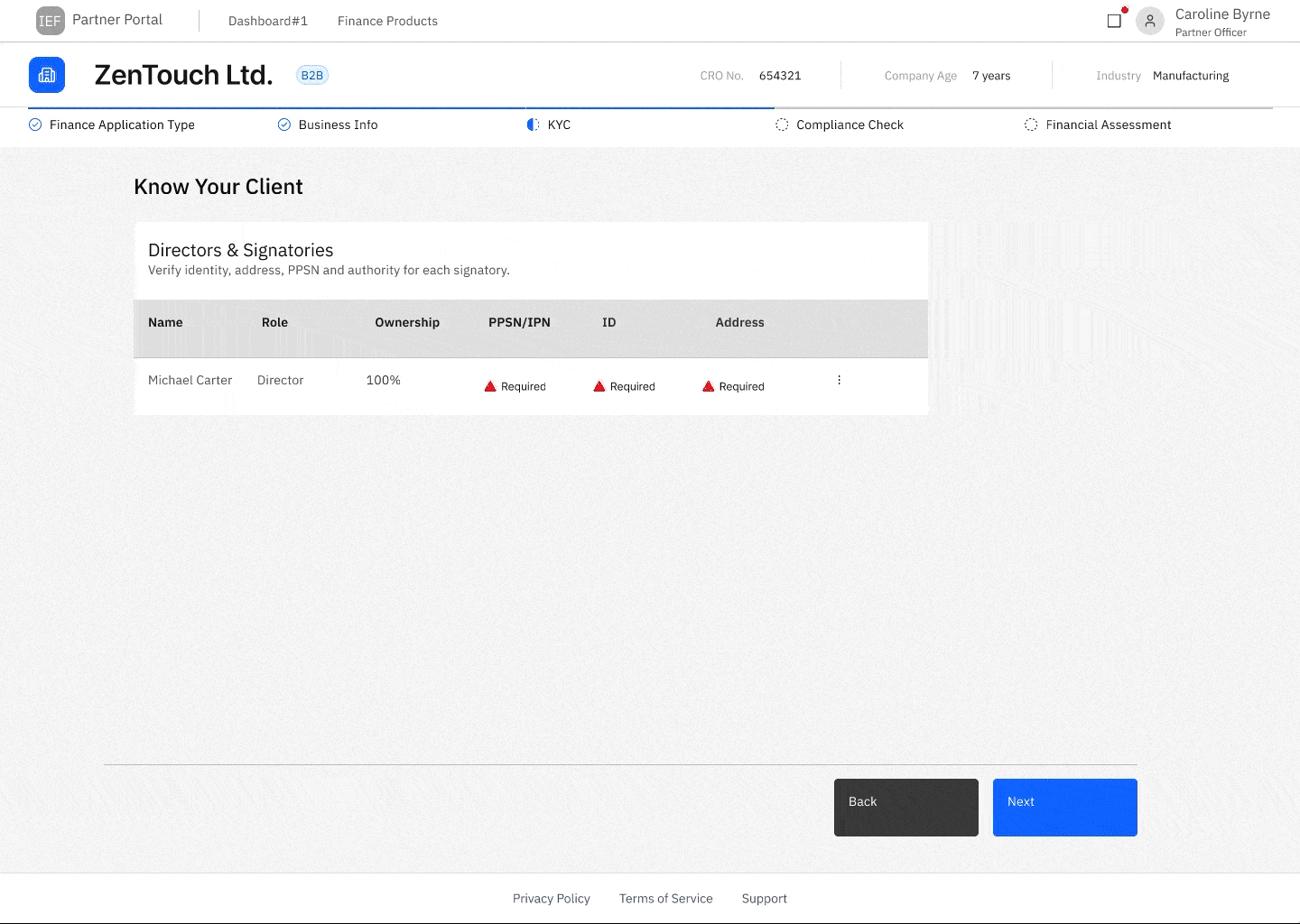
Built on IBM Carbon’s expandable tile pattern, this component was iterated to refine action hierarchy, icon alignment, and content density within the expanded state. Testing focused on keeping key decisions in context while ensuring the tile remained scannable and predictable for brokers.
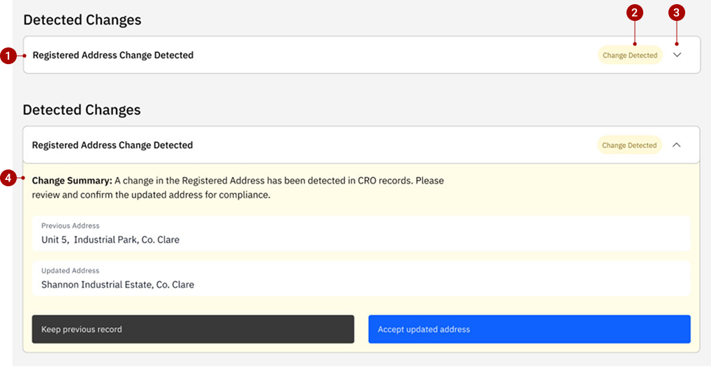
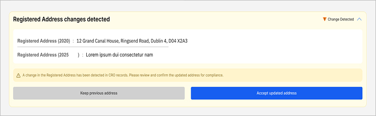
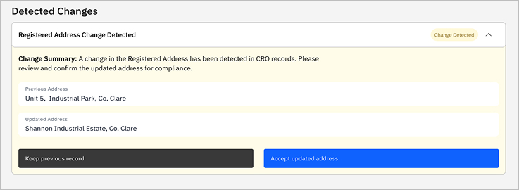
At this stage of the flow, the system is verifying externally sourced data and guiding brokers on where attention is required, without implying approval or failure. At the data verification stage, IBM Carbon’s contained list component was adapted to support layered attention without introducing validation or approval semantics. To support this, a single Carbon component (Contained List) is reused with layered signals at different levels.
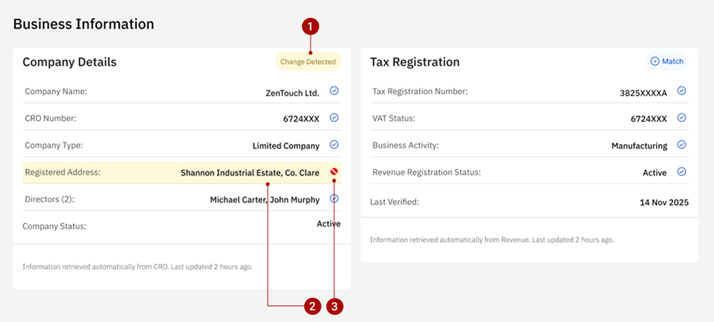
When a data mismatch requires explicit broker action, an alert-triggered resolution panel is introduced. Built on Carbon’s accordion pattern, the component expands only when needed to present change context, structured comparison, and clear resolution actions. Informational tagging and restrained emphasis guide compliance decisions without interrupting the broader application flow.
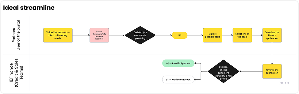
Based on research findings, pain points, and system constraints, I proposed an end-to-end workflow outlining how brokers could move from data entry to submission. This workflow was first articulated in low fidelity to define structure, sequence, and responsibility boundaries, and then translated into mid-fidelity designs to explore component behaviour, feedback patterns, and system responses.
The transition from low to mid fidelity did not involve changing the workflow itself. Instead, it focused on making the proposed flow concrete and testable by introducing clearer information hierarchy, design-system components, and system feedback.
Mid-fidelity testing focused on how brokers interpret system feedback, resolve detected data changes, and progress through review stages. Testing highlighted issues around clarity, visual hierarchy, and action placement rather than task order.
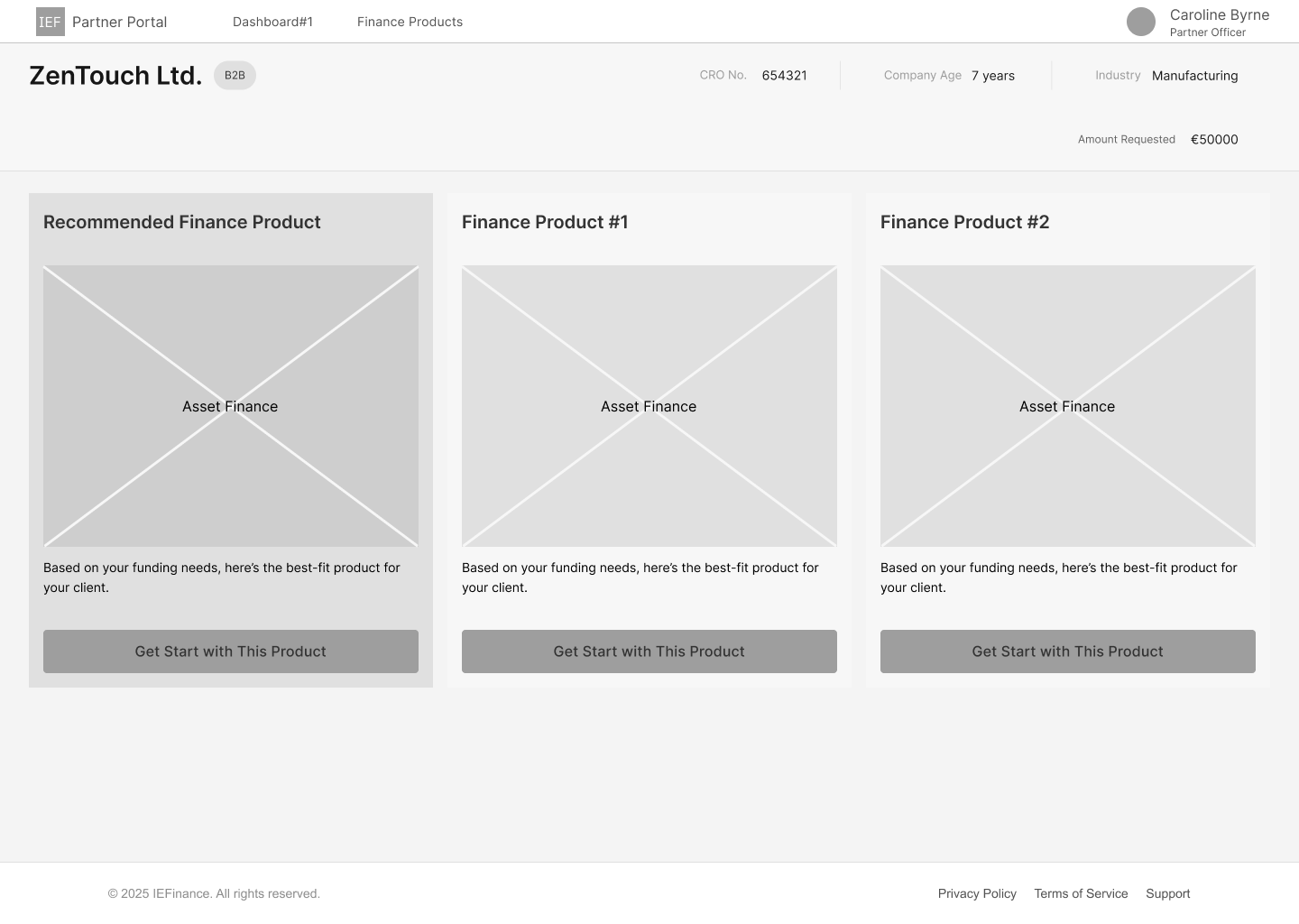
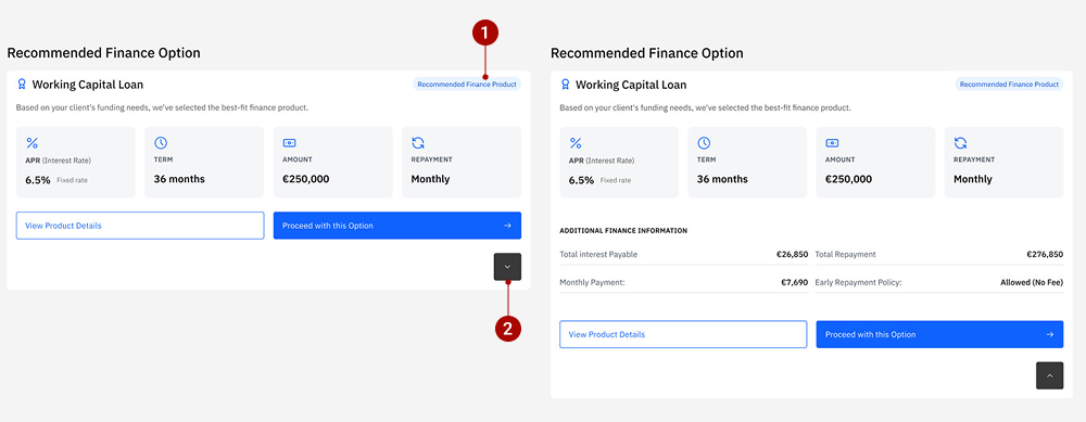
This iteration focused on improving the discoverability of additional product details while preserving clarity between borrowing details and the system-recommended option.
The expand control for the recommended product was visually understated, causing users to overlook the availability of additional product details. While the recommendation itself was clear, accessing deeper information required extra scanning.
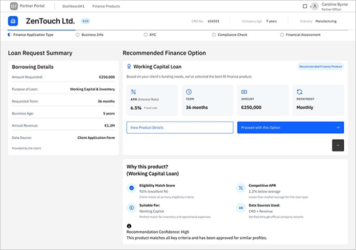
The expand affordance was made more discoverable and aligned more closely with the recommended product content. Additional finance information was surfaced in a clearer, more intentional way, supporting partners who needed to explain the recommendation in greater detail to clients.
The iteration reduced hesitation around accessing extended details while maintaining a clear visual link between client inputs and the system-recommended product.
As the design moved toward high fidelity, refinements focused on visual hierarchy, semantic colour usage, and accessibility—without changing component behaviour or workflow.
This interaction was explored as a proposed solution to manage
complex KYC tasks without breaking table context.
It was lightly tested with a small number of users to assess
discoverability and basic usability. Participants were able to
locate the overflow menu and complete document uploads via the
drawer, indicating that the interaction was understandable, though
not fully validated at scale.
The final prototype demonstrates how brokers can progress through complex loan applications with greater clarity, reduced manual effort, and clear system feedback—while maintaining compliance and auditability.
In this B2B project, limited access meant relying on exploratory research, informed assumptions, and AI-assisted surveys. While directionally validated, direct broker input would have strengthened confidence in user and loyalty flows.
Usability testing was conducted with participants close to the target context. With real brokers, I would measure task completion time, error rates, and drop-off to quantify improvements.
Time constraints focused UI work on adapting the IBM Carbon Design System. With more time, I would further refine the UI and explore alternative systems while maintaining Carbon for enterprise consistency.
Working on this project through the UX Tree mentorship programme was a genuinely rewarding experience, and I’m grateful for the support and encouragement throughout the process.
To my mentor, Alessia Rossini, I’m very glad I had the opportunity to work with you. You dedicated a great amount of time to supporting me on a complex project focused on redesigning a loan application. I truly appreciate your guidance and experience, which helped me stay focused and expand my UX design methodologies—incorporating more up-to-date, technology-aligned approaches.
Thank you as well to the mentors and mentees who shared feedback, tested the designs, and offered thoughtful insights along the way. Your input strengthened the project and gave me valuable perspectives throughout the process.
Thank you!